Anyone who has chosen a paint colour from a fan deck and then watched it transform on the wall knows the frustration. The warm grey that looked perfect in the shop reads blue in the hallway. The soft white feels clinical in the bathroom but beautiful in the kitchen.
This is not a failing of the paint. It is light.
Northern European light (noordelijk licht), the light most of us live with in the Netherlands, the UK, Belgium, and Scandinavia, is cooler, lower, and more diffused than Mediterranean or southern light. It shifts constantly through the day and changes dramatically with the seasons. Understanding this is the single most useful thing you can do before choosing a colour.
How Northern Light Affects Colour
Cool undertones are amplified. A grey with a blue undertone will read bluer. A white with a violet base will feel cold. This is why so many people end up disappointed with greys, they pick a colour that looks neutral in warm showroom lighting and are surprised when it feels icy at home.
Warm undertones are softened. Colours with yellow, pink, or red bases tend to feel more balanced in northern light. They do not become garish, the diffused light takes the edge off.
South-facing rooms (in the northern hemisphere) receive the warmest, most consistent light. Here you can afford cooler tones, a true grey, a blue-white, even a soft green, and they will feel alive rather than flat.
North-facing rooms receive cool, indirect light all day. Warm neutrals are your friend here. Anything too cool will feel unwelcoming.
East-facing rooms get warm morning light and cool afternoon shade. Consider how you use the room, a bedroom that catches morning sun can handle cooler tones; a living room used mainly in the evening cannot.
West-facing rooms glow in the afternoon and evening but feel flat in the morning. Warm neutrals work well, and deeper colours come alive as the day progresses.
The Colours That Consistently Work
This is not a prescriptive list, but these are the tonal families I return to most often for properties in the Netherlands and the UK.
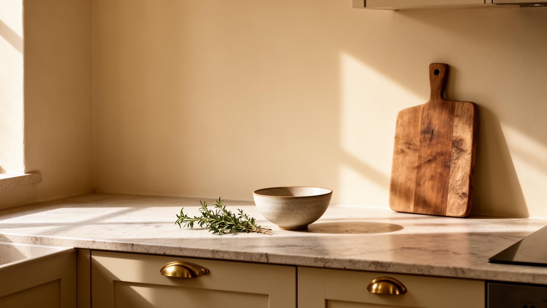
Warm whites: Not brilliant white, which reads blue in northern light, but whites with a yellow, pink, or earthy undertone. These are the whites that feel like light without feeling cold. Farrow & Ball's Pointing or Wimborne White are reliable examples. Atelier Ellis produces beautifully nuanced warm whites with real depth, worth sampling if you want something less ubiquitous.
Warm greys: The trick with grey in northern light is to lean warm. Look for greys with a brown, pink, or green undertone rather than blue. Little Greene has an exceptional range of warm greys, their Cool Arbour and Joiner are both excellent in north-facing rooms. Mylands produces greys with a richness that comes from their heritage pigments.
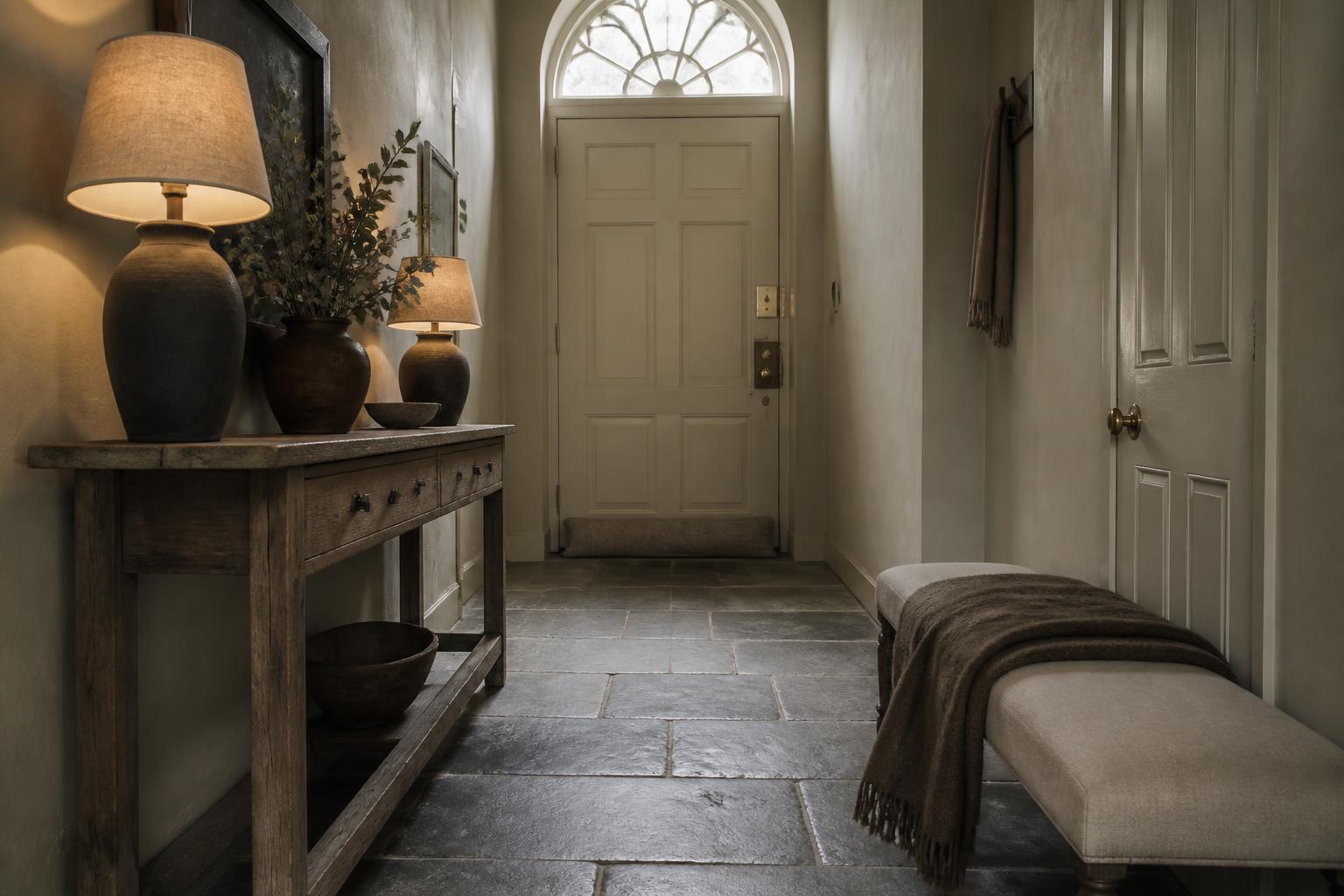
Earthy neutrals: Mushroom, putty, stone, clay. These are the tones that feel entirely at home in older European properties. They shift gently through the day and pair beautifully with both timber and stone. Edward Bulmer paints are particularly good here, made with natural earth pigments, they have a depth that synthetic equivalents struggle to match.
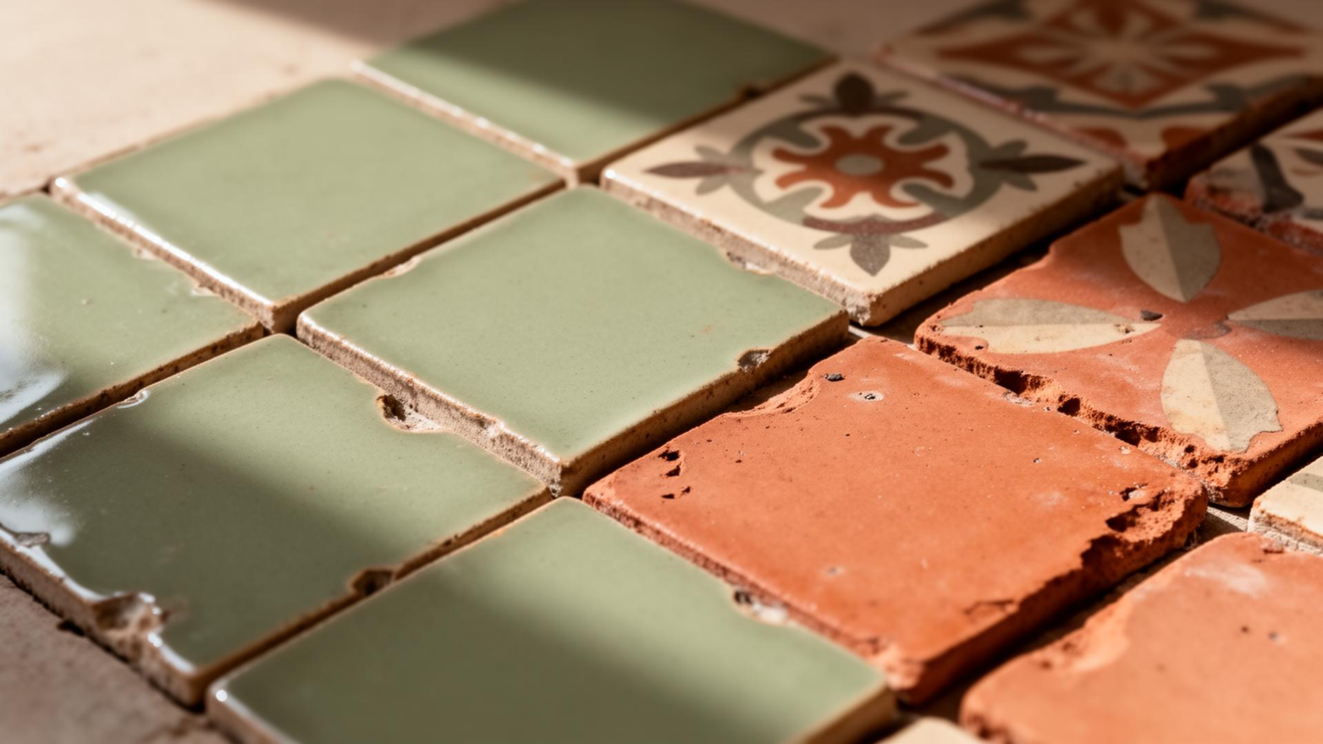
Greens: Green is surprisingly versatile in northern light. Sage, olive, and muted forest tones all work well, particularly in rooms with garden views. They connect interior and exterior without feeling forced. Ressource, the French paint house, produces some of the most beautiful muted greens available.
Deep and dark: Do not be afraid of dark colours in low-light rooms. A rich charcoal, deep navy, or warm black can make a north-facing room feel intimate and considered rather than gloomy. The key is to commit, paint the ceiling and woodwork the same colour. Francesca's Paints offers extraordinary depth in their darker shades, and their matt finish absorbs light beautifully.
Practical Advice for Choosing
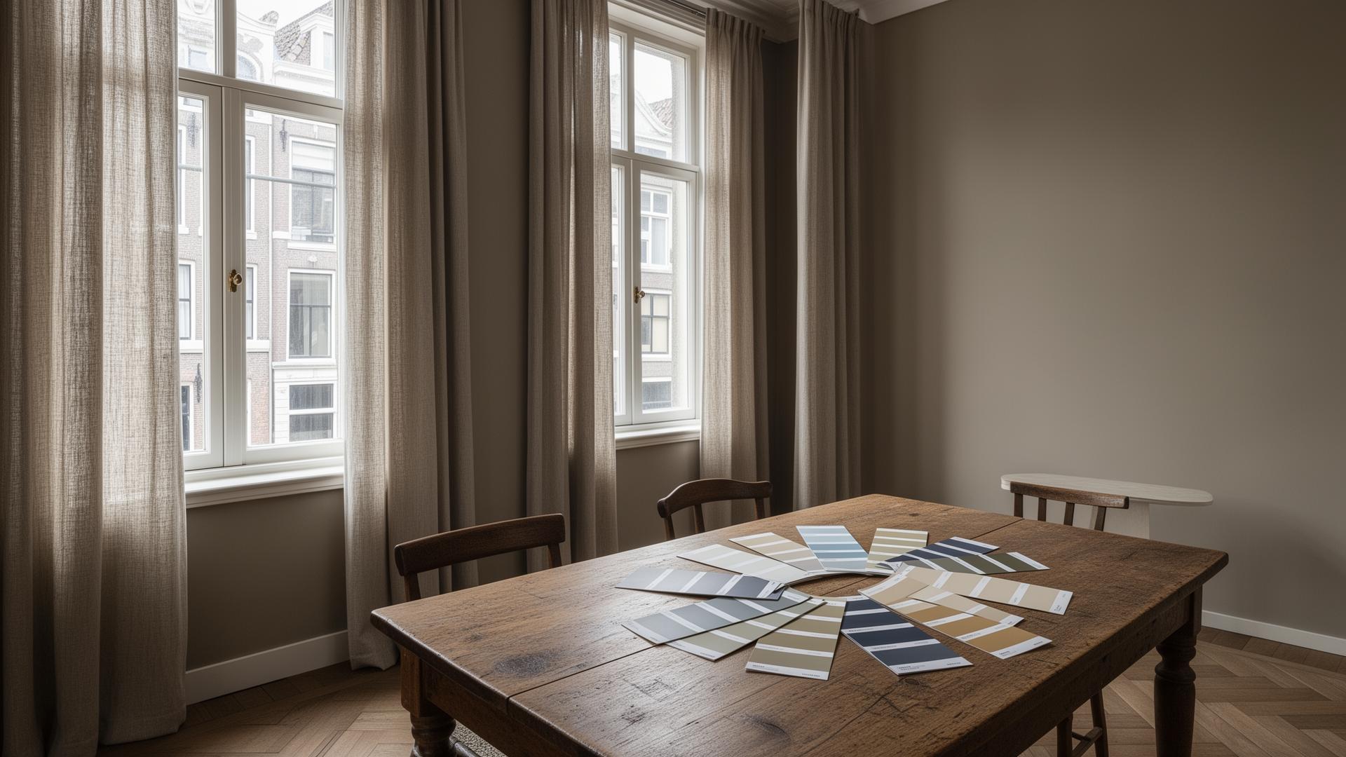
Always sample on the wall, not on card. Paint a large swatch (at least A3) on two walls, one that catches light, one that does not. Live with it for at least 48 hours across different light conditions.
Test at night under artificial light. Your room does not exist only in daylight. How a colour reads under your lamps matters just as much.
Look at the undertone, not the name. Paint names are marketing. A colour called 'Warm Stone' might have a cool undertone. Always check the colour's base: is it yellow, pink, blue, green, or grey?
Consider the finish. Matt finishes absorb light and feel softer, which tends to work well in period properties. Eggshell reflects a little more and can make a colour feel brighter. In darker rooms, a slight sheen can help.
Use the same white throughout for ceilings, woodwork, and trim. This creates a consistent thread through the house, even when wall colours change from room to room.
A Note on Lime and Mineral Paints
If you are working with an older property, particularly anything pre-war with original plasterwork, consider lime-based or mineral paints. These breathe with the building and develop a beautiful chalky depth that modern emulsions cannot replicate.
Bauwerk Colour produces lime-based paints with extraordinary texture and tonal variation. They are particularly effective in homes where the walls have character, unevenness, patina, history. Papers & Paints in London is also worth visiting for specialist and historic colour matching.
Choosing colour for a northern European home is not about following trends or picking what looks good on a screen. It is about understanding how light moves through your rooms, what undertones do in diffused conditions, and being willing to test properly before committing.
The right colour will shift beautifully through the day. It will feel warm on a grey January morning and cool on a bright summer afternoon. It will make your furniture look better, your art more considered, and your home more like itself.
Take your time. Sample generously. And trust what you see on the wall, not what you see on the tin.