Choosing paint colours is one of the most personal decisions you will make, and one of the most scrutinised. Get it right and the walls recede, the light lifts, and every piece of furniture looks like it belongs. Get it wrong, and the whole room can feel off.
Here is how I approach colour selection.
Start with the Light
Before you pick up a fan deck, spend time in the room at different hours. Morning light in a north-facing room is very different from afternoon sun streaming through south-facing windows. Some rooms shift dramatically from cool grey mornings to warm amber evenings, so the paint needs to work with both.
Ask yourself:
- When do you use this room most?
- Is the light warm or cool?
- Are there deep window reveals, low ceilings, or corners that trap shadow?
A colour that looks perfect in a bright showroom can turn muddy in a darker room. Always test.
Work with Your Architecture
Every home has its own character: proportions, features, and quirks that deserve respect. The right colour can highlight these; the wrong one can flatten them.
General guidance:
- High ceilings and generous rooms can take deeper, more saturated tones
- Low ceilings and compact spaces often benefit from lighter, warmer shades
- Decorative mouldings and cornicing stand out against a contrasting wall colour
- Simple, pared-back rooms can handle bolder choices without overwhelming
Whether you are in a Georgian townhouse, a 1930s semi, or a modern apartment, let the bones of the building guide you. What works in a double-height loft will not necessarily suit a cottage with small windows.
The Art of Colour Drenching
One of the most impactful trends in recent years is colour drenching: painting walls, ceiling, woodwork and even radiators in the same shade. The effect is immersive and surprisingly calming. Rather than the eye jumping between different elements, everything flows together.
Colour drenching works particularly well in:
- Small rooms where it creates a cocooning effect
- Rooms with lots of architectural detail: cornicing, panelling, and picture rails become sculptural rather than busy
- Snugs, studies, and bedrooms where you want to feel enveloped
The key is to commit fully. Half measures (painting just the walls and leaving the ceiling white) can make the ceiling feel disconnected and lower. Go all in, and the space feels considered and complete.
A Word About White
White is never just white. There are warm whites, cool whites, whites with pink undertones, yellow undertones, and grey undertones. Choosing the wrong one is surprisingly easy.
It is perfectly fine, even advisable, to use different whites throughout your home. A north-facing hallway might need a warmer white to counteract the cool light, while a sunny south-facing kitchen could handle a crisper, cooler shade. Trying to use one white everywhere often means it looks right in one room and wrong in another.
Some favourites:
- Warm whites: Wimborne White (Farrow & Ball), Flax (Little Greene), Canvas (Edward Bulmer)
- Cool whites: Strong White (Farrow & Ball), Loft White (Little Greene)
- Soft off-whites: Pointing, School House White, Shaded White (all Farrow & Ball)
Do not rush this decision. White is the backdrop to everything else, and getting it right is worth the effort.
Quality Paint Matters
Not all paint is created equal. Heritage ranges (Farrow & Ball, Little Greene, Atelier Ellis, Edward Bulmer, Papers and Paints, Pure & Simple) offer colours with nuanced pigments that sit well against natural materials. Mylands offers a gorgeous range rooted in London heritage, while Bauwerk Colour produces lime-based paints with extraordinary depth and texture. Contemporary brands like Paint & Paper Library or even well-formulated high-street options can work beautifully too.
What matters is the depth of colour and how it responds to light. Cheaper paints often look flat or plasticky. Invest in quality, and the walls will repay you.
Some combinations I have seen work beautifully:
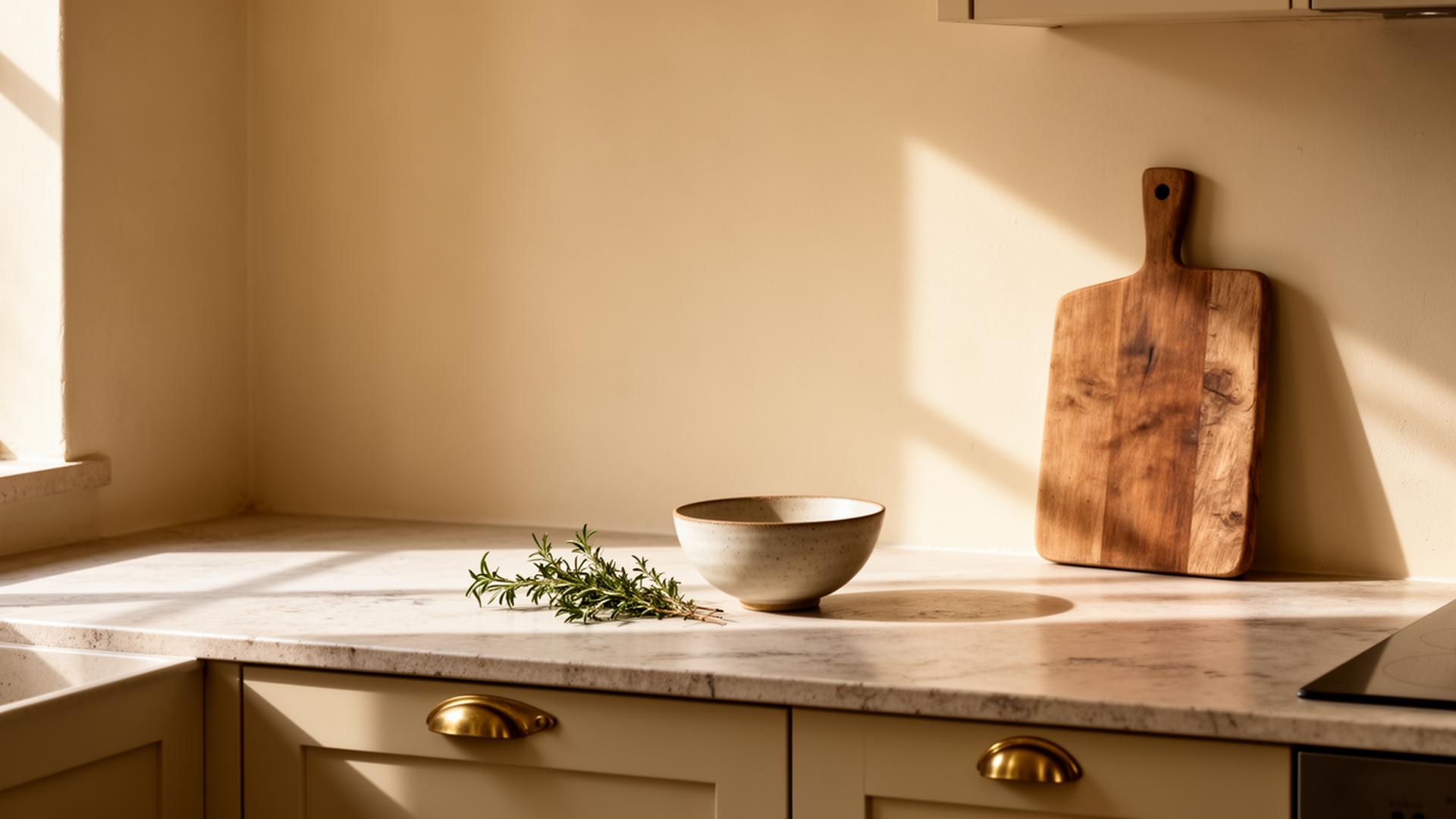
- Warm whites with a hint of ochre in stone-floored or tiled kitchens
- Deep, earthy greens in studies and snugs
- Soft blue-greys in bedrooms with good natural light
- Off-blacks on joinery, with chalky walls for contrast
Specialist Paints for Historic Surfaces
If you are fortunate enough to have original lime plaster, exposed stone, or limestone walls, you will need to think carefully about paint type, not just colour.
Breathable paints are essential for these surfaces. Standard modern emulsions create a film that traps moisture, leading to damp, flaking paint, and damage to historic fabric. Instead, look for:
- Limewash: the traditional choice for lime plaster and stone. It creates a beautiful, chalky, slightly mottled finish that ages gracefully. Colours deepen when wet and soften when dry.
- Mineral paints: silicate-based paints that bond chemically with the substrate. More durable than limewash while still allowing the wall to breathe.
- Distemper: soft, utterly matt, and wonderfully sympathetic to old surfaces. Not as durable as modern paints, but beautiful in the right context.
Brands like Rose of Jericho, Earthborn, and Keim specialise in breathable paints. If in doubt, consult a conservation expert before painting historic surfaces.
Test Properly and Live With It
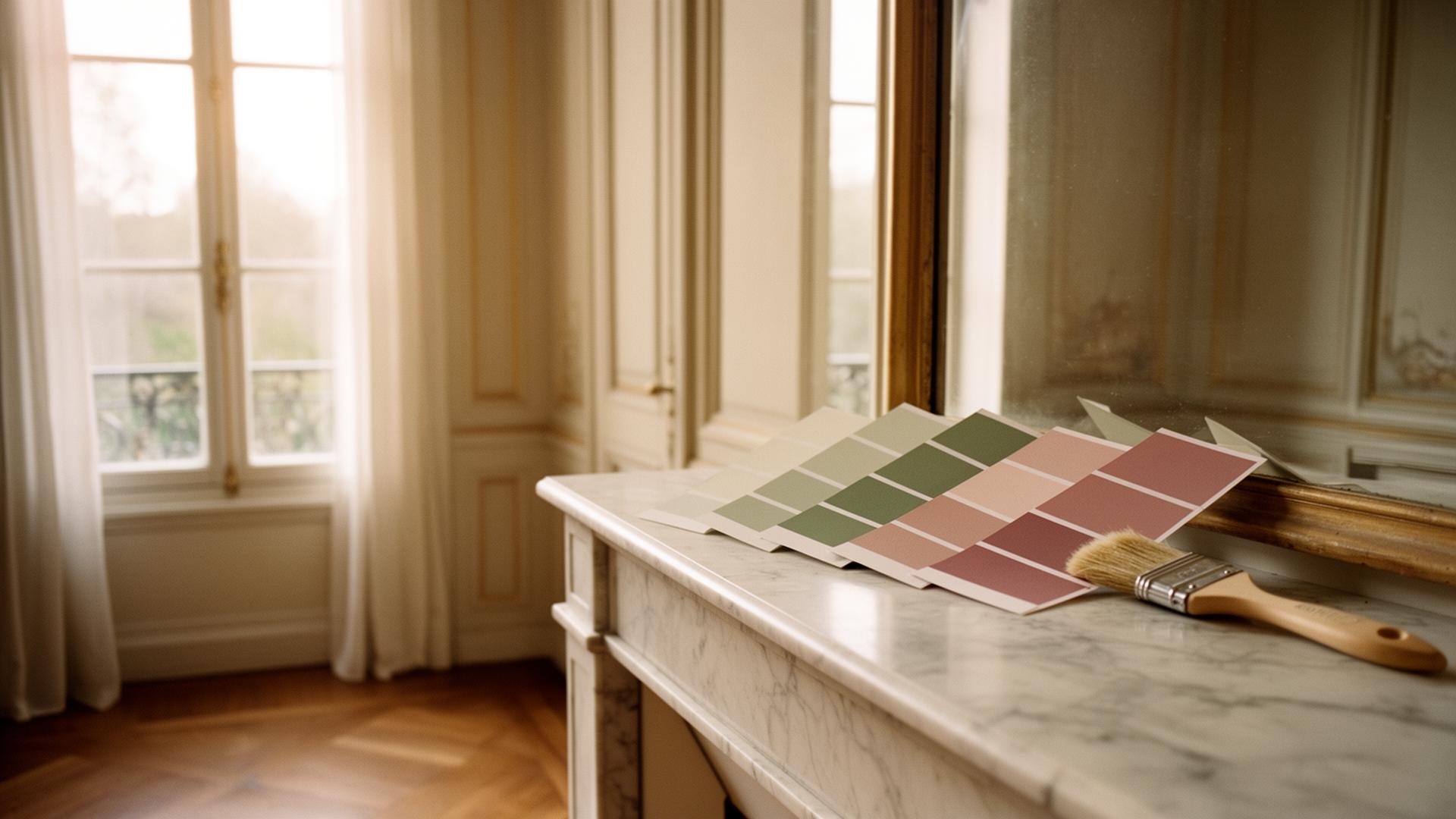
Never commit based on a small swatch. Paint large samples, at least A3, and view them:
- On different walls (not just the lightest one)
- At different times of day
- With the furniture and textiles you plan to keep
I recommend painting directly onto the wall if possible, or using sample boards you can move around. And always test in the actual room, not somewhere with different light.
Live with the colour for at least a week before deciding. Better still, two weeks. You will see it in morning light and evening light, on bright days and overcast ones. If something feels off after this time, trust that instinct. It is much easier to repaint a sample area than an entire room.
Moody Rooms and Dark Colours
There is something deeply appealing about a moody, enveloping space, and dark colours are having a well-deserved moment. Do not be afraid of them, even in smaller rooms. Dark shades can make a space feel intimate rather than cramped.
Popular choices for dramatic interiors:
- Dark blues: Hague Blue, Stiffkey Blue (Farrow & Ball), Basalt (Little Greene), sophisticated and surprisingly versatile
- Dark greens: Studio Green, Green Smoke (Farrow & Ball), Obsidian Green (Little Greene), rich and grounding
- Burgundy and wine tones: Preference Red, Eating Room Red (Farrow & Ball), Bronze Red (Little Greene), warm, inviting, perfect for dining rooms
- Warm blacks and charcoals: Railings, Off-Black (Farrow & Ball), Lamp Black (Little Greene), dramatic without being stark
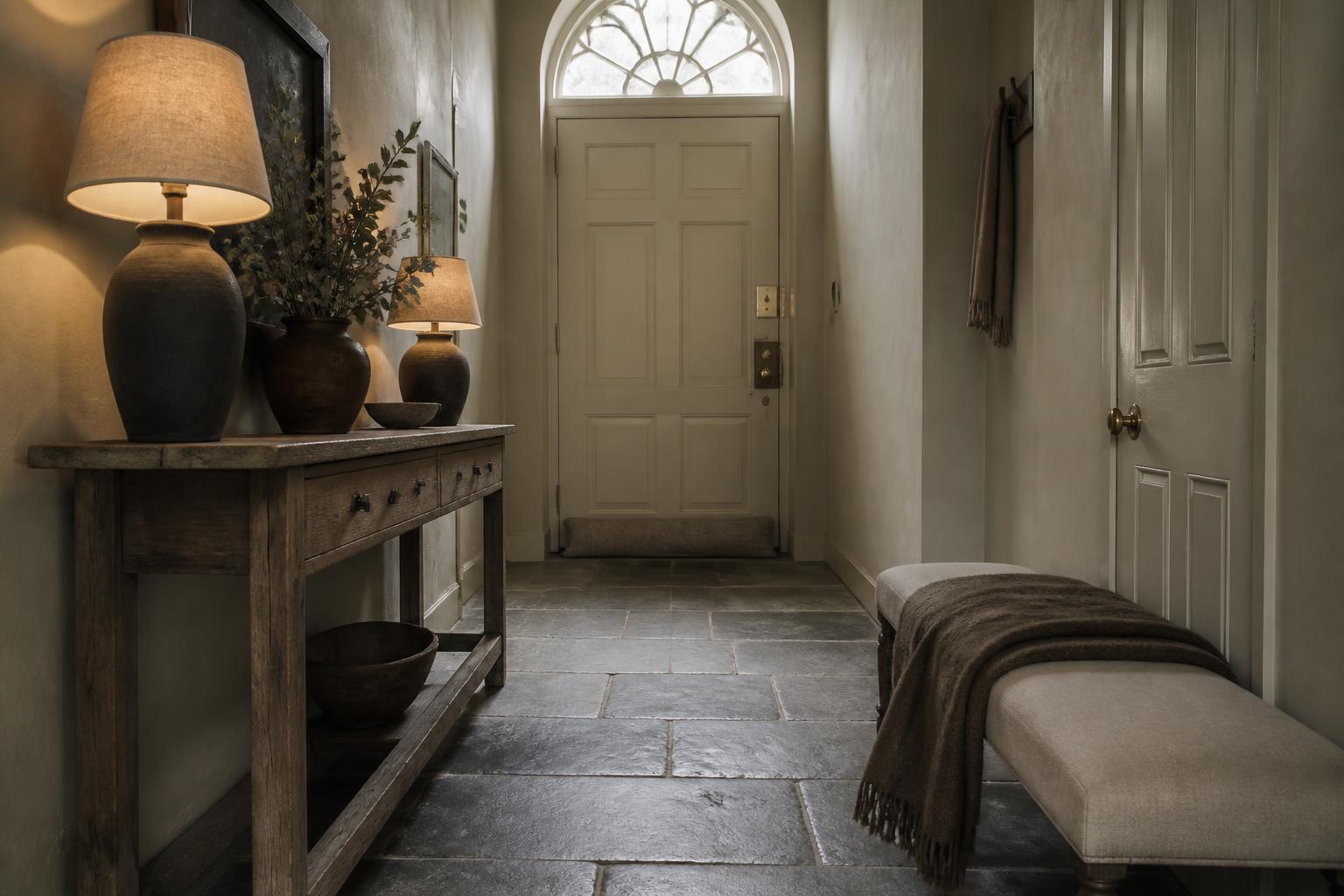
The trick with dark colours is lighting. You will need good artificial light (layered, dimmable, and warm) to prevent the room feeling gloomy. Combine dark walls with lighter floors, generous mirrors, and metallic accents to keep things balanced.
Consider the Flow
Colour choices in one room affect how adjacent spaces feel. If you can see from the hallway into the sitting room and through to the kitchen, those colours need to converse.
This does not mean everything has to match, but the palette should feel considered. Warm tones in one room followed by stark cool whites in the next can be jarring. Think about the journey through your home.
Joinery and Ceilings
Do not forget the trim. Skirting boards, door frames, window surrounds: these can make or break a scheme.
Options to consider:
- Same as walls for a seamless, contemporary feel that makes rooms appear larger (this is where colour drenching really shines)
- Contrasting shade (off-white, soft grey, or a bold accent) to define architectural edges
- Dark or off-black for drama and to draw the eye to beautiful joinery
For ceilings, a slightly lighter version of the wall colour often feels more cohesive than brilliant white, which can look stark, particularly in rooms with warm-toned walls.
Undertones and Coordination
Every colour has an undertone, and understanding this is key to creating a cohesive scheme. A grey might lean blue, green, or purple. A white might have pink, yellow, or grey undertones.
When colours clash, it is usually because their undertones are fighting. A warm-toned grey on the walls will not sit comfortably next to cool-toned grey furniture. Pay attention to what is beneath the surface colour.
Many paint brands now group colours by undertone, which can help. Or simply trust your eye. If two samples placed side by side look uncomfortable together, they probably are.
Colour is deeply personal, but it is also about context. The best choices honour your space while reflecting how you live. Take your time, test thoroughly, and trust your eye. If something feels off after living with a sample, it probably is.
And remember: paint is one of the most transformative yet reversible changes you can make. If you get it wrong, you can always repaint. So be bold, take your time, and enjoy the process.