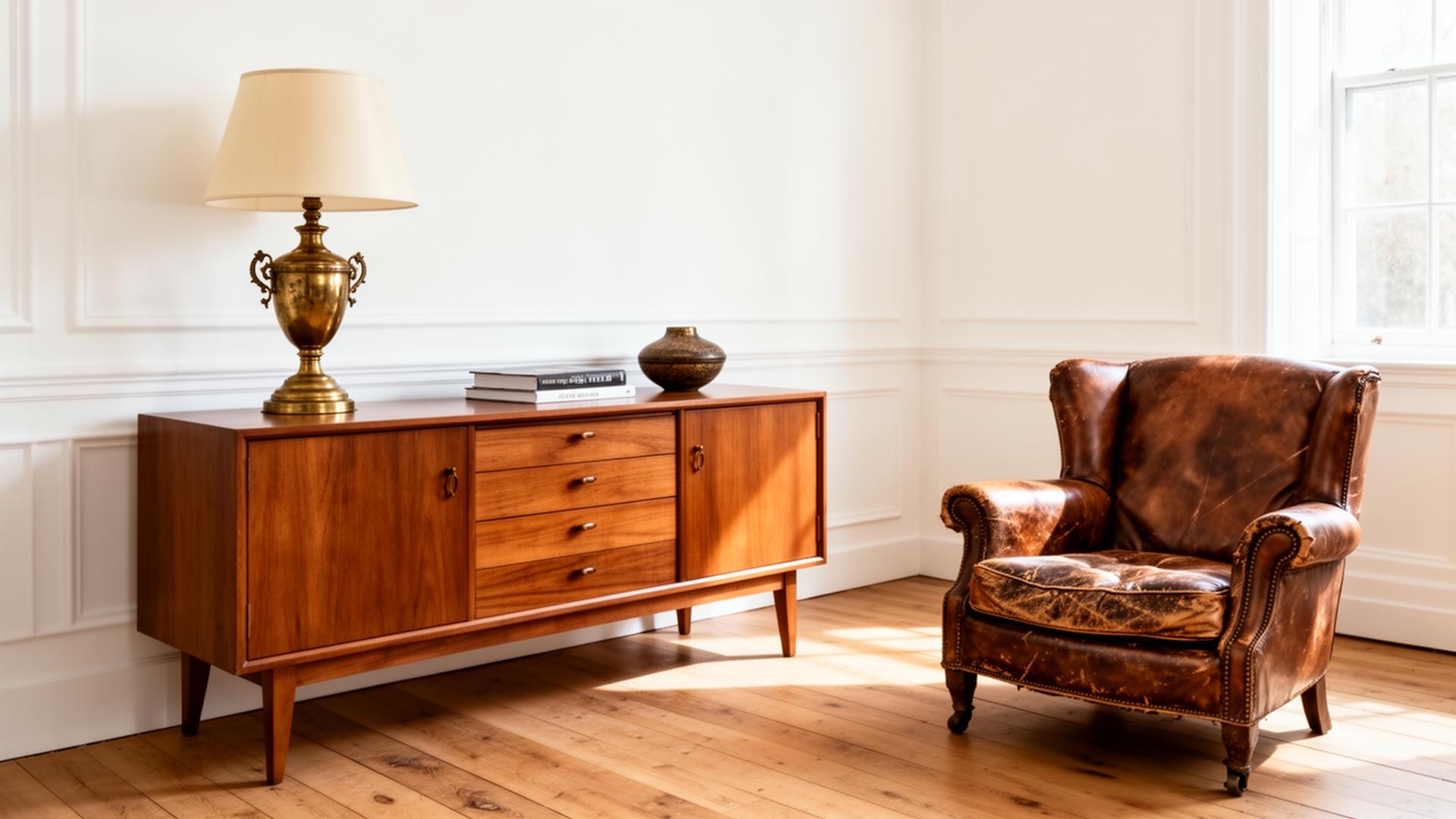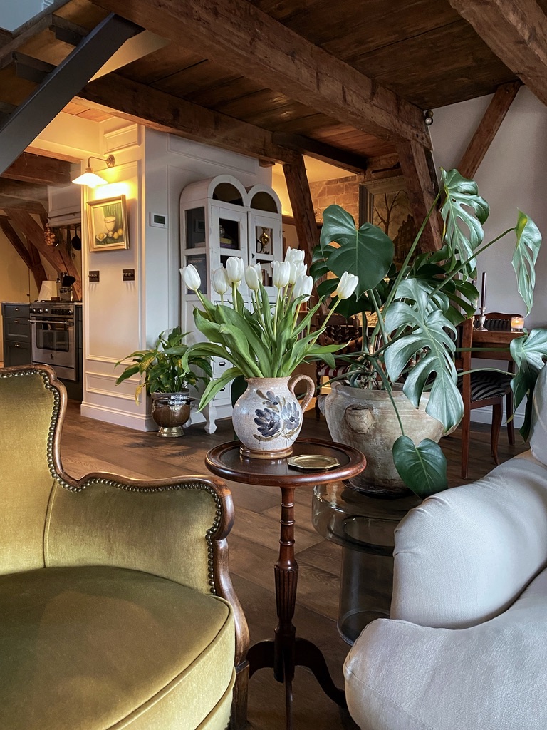
Open shelving is one of those features that divides people. Some love the warmth and character it brings to a room; others see only the maintenance and the dust. Both perspectives are valid, and the difference between shelving that works and shelving that does not almost always comes down to how it is styled.
A well-curated shelf tells you something about the person who lives there. It reveals their taste, their travels, their interests. A badly styled shelf just looks like storage with no doors. The space between the two is smaller than you might think.
Before You Style: The Shelf Itself
Styling can only do so much if the shelves themselves are wrong for the room. Material, thickness, and bracket choice set the tone before a single object goes on display.
Timber is the most forgiving. Oak reads warm and traditional, walnut richer and more contemporary, painted timber crisper and more architectural. Reclaimed boards bring patina that new timber takes decades to develop. Whatever you choose, pay attention to thickness. Anything under 30mm tends to look flimsy on a wall of any scale; 40 to 50mm sits more confidently and carries weight without bowing.
Stone and marble bring weight and permanence. A honed limestone or Carrara marble shelf in a kitchen or bathroom feels quietly luxurious and ages beautifully, though both need proper structural support. Travertine and soapstone are softer alternatives with more visible character.
Metal shelves, in blackened steel, brushed brass, or powder-coated aluminium, suit more architectural interiors. Thin steel plate (6 to 10mm) can span surprising distances without bowing and gives a precise, almost industrial line. Brass develops a beautiful patina over time; steel can be left raw and waxed for a softer matte finish.
Glass suits bathrooms, drinks cabinets, and display niches where you want the contents to take centre stage. Toughened glass with polished edges keeps the look refined; reeded or fluted glass adds texture without heaviness.
Painted MDF or plywood is the most affordable route and can look genuinely beautiful when the edges are detailed properly and the paint finish is good. A built-in run of painted shelving in a deep colour reads as cabinetry rather than a budget compromise.
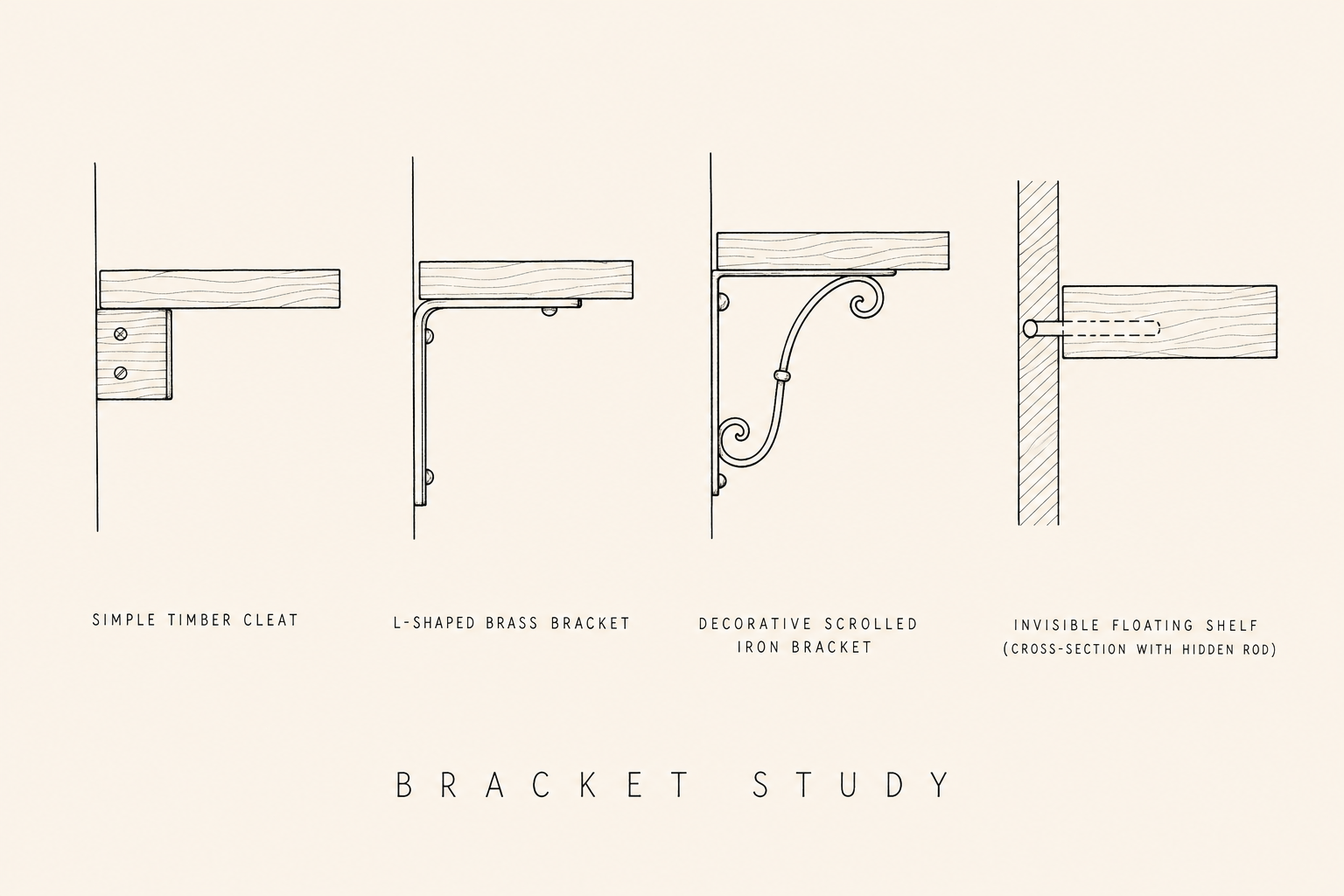
Brackets are a design decision, not an afterthought. A simple timber cleat almost disappears and lets the shelf itself do the talking. An L-shaped brass bracket reads as a deliberate detail and ages beautifully. A scrolled iron bracket adds Victorian or Arts and Crafts character. A truly invisible floating shelf, with a hidden steel rod drilled into the wall, gives the cleanest modern line but requires solid masonry behind the plaster.
The Backdrop
What sits behind the shelves matters as much as what sits on them. The backdrop is what gives objects something to read against, and it is worth a moment of consideration.
A white wall behind warm timber shelving can be lovely. The contrast is clean and the wood does the heavy lifting; in light-filled rooms or pared-back interiors, this is often the most beautiful choice. Where shelves can fall flat is against a tired off-white in a darker room, where there is not enough contrast to give the objects definition.
Painting the back wall in the same colour as the cabinetry, or in a deeper tone than the surrounding room, gives the shelves more weight and makes objects read more clearly. Tongue and groove panelling behind shelving adds quiet texture and works particularly well in kitchens, pantries, and utility spaces. Zellige tiles run all the way up behind kitchen shelving create a beautiful, slightly irregular backdrop that catches the light. In a study or living room, a deep paint colour, Farrow and Ball's Studio Green, Inchyra Blue, or De Nimes, turns the shelves into something closer to a cabinet of curiosities.
The Foundation: Edit Before You Style
The most important step happens before anything goes on the shelf. Gather everything you are considering, books, objects, ceramics, plants, photographs, and edit ruthlessly. Not everything deserves a place on display.
Ask yourself three questions about each piece: Do I genuinely like it? Does it add something visually, in colour, texture, shape, or material? Would I miss it if it were not there?
If the answer to any of these is no, it goes in a cupboard. Open shelving is not storage; it is curation. The restraint is what makes it work.
The most common mistake with open shelving is putting too much on display. Every shelf needs breathing room. If you cannot see the back wall between objects, you have too many things.
The Principles
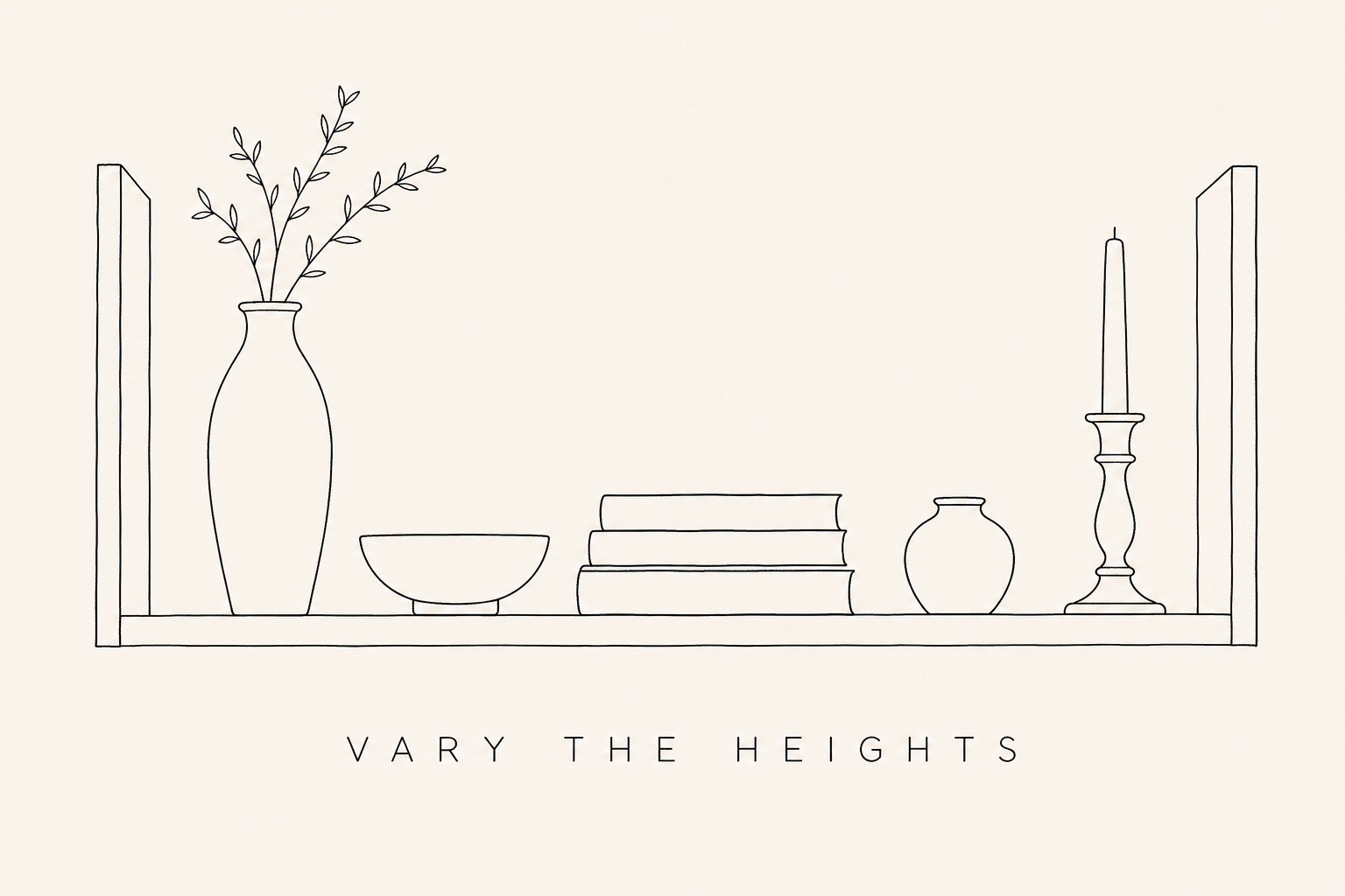
Vary the heights. A shelf where everything is the same height feels flat and monotonous. Alternate between tall and short objects, a stack of books next to a small ceramic, a tall vase beside a low bowl. This creates rhythm and keeps the eye moving.
Mix textures and materials. Combine smooth ceramics with rough stoneware, woven baskets with polished wood, matte finishes with glossy ones. The contrast between textures is what gives a shelf depth and visual interest.
Group in odd numbers. Three or five objects clustered together almost always read better than two or four. Odd numbers create natural asymmetry and force the eye to move between the pieces rather than pairing them off. It is a small rule but a reliable one.
Anchor each shelf. Every shelf benefits from one piece that holds the composition together, a larger vase, a stack of substantial books, a piece of framed art leaning at the back. Without an anchor, a shelf can read as a scattering of objects rather than a considered arrangement. Place the anchor slightly off-centre and build the rest of the composition around it.
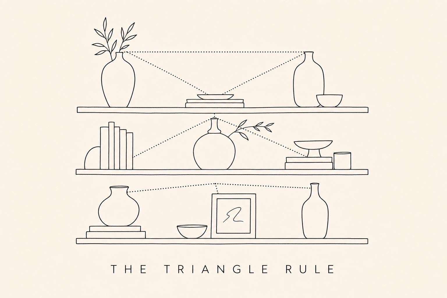
Use the triangle rule. When you step back from a styled shelf, your eye should be able to trace implied triangles between objects of similar height, colour, or material. A brass candlestick on the top shelf, a brass bowl on the middle, a brass picture frame on the bottom: the eye links them, and the whole arrangement holds together.
Use books as building blocks. Stacked horizontally, books become platforms and plinths for smaller objects. Grouped vertically, they create height and structure. Mix orientations on different shelves for variety. Choose books with spines that complement your colour palette, or turn some around for a quieter, more textural look.
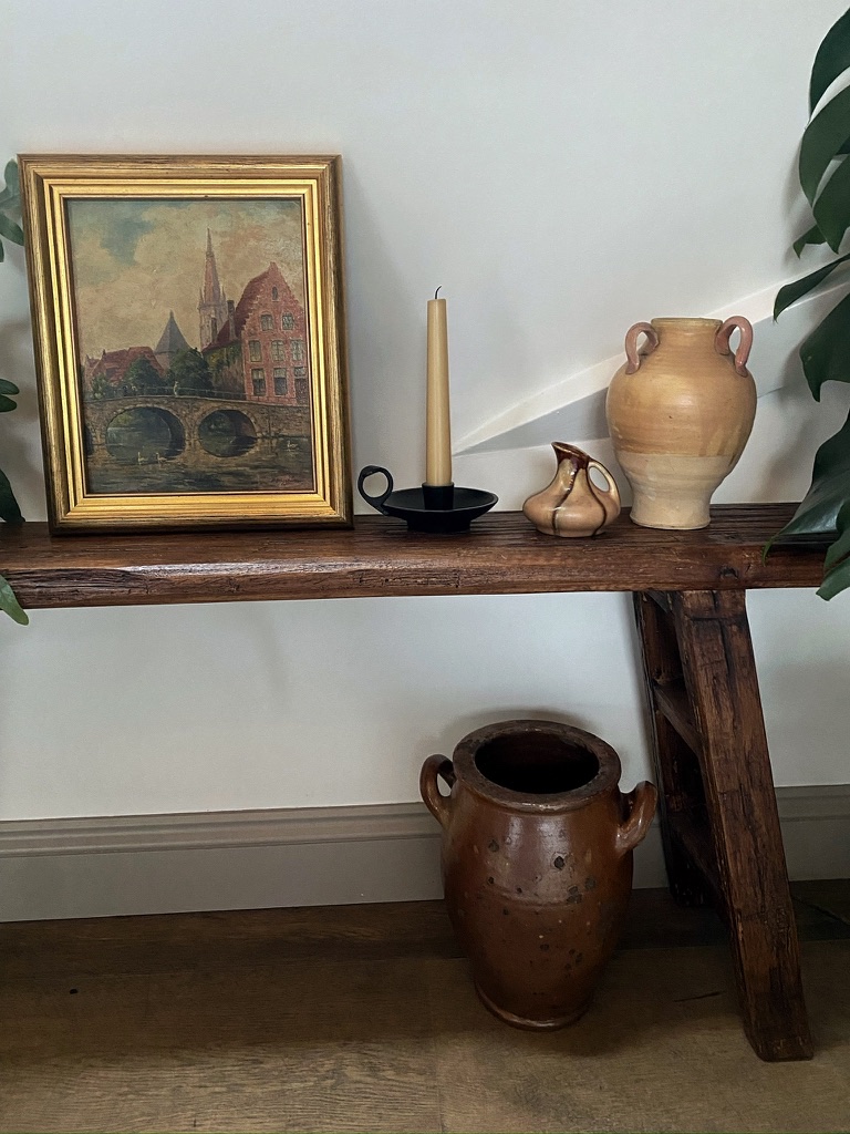
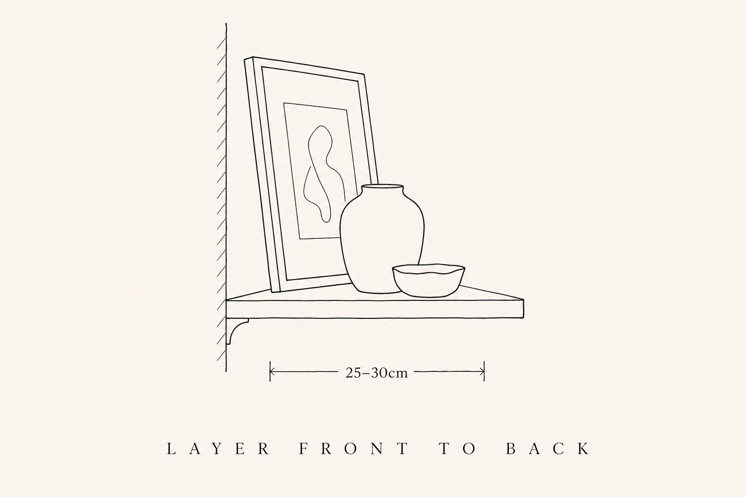
Layer front to back. Lean artwork or photographs against the wall at the back of a shelf, then place smaller objects in front. This creates depth and makes the shelf feel three-dimensional rather than flat.
Function and Decoration
A useful mental model is the ratio of functional to decorative objects on each shelf. In a kitchen, you might aim for roughly two-thirds practical, plates, bowls, glassware, and one-third decorative, a vase, a small artwork, a piece of pottery. In a living room, the ratio inverts: more decorative, fewer functional pieces.
Whichever direction you lean, avoid the all-or-nothing trap. A shelf that is purely functional looks like restaurant storage; a shelf that is purely decorative starts to feel like a shop window. The best arrangements borrow from both.
Colour and Cohesion
A shelf can hold a wide variety of objects and still feel cohesive if the colour palette is considered. You do not need everything to match, but there should be a thread, a shared warmth, a repeated accent colour, a consistent neutral backdrop.
If your shelves feel chaotic, the quickest fix is colour. Remove anything that clashes with the dominant palette and see how much calmer the arrangement becomes.
Neutral palettes, whites, creams, warm woods, natural fibres, are the easiest to maintain and the most forgiving. They work in almost any room and allow you to add seasonal accents without restyling the entire shelf.
Considered colour, a collection of blue-and-white ceramics, a shelf of green-spined books, brass objects against a dark wall, creates a stronger visual statement but requires more discipline to maintain.
Depth and Spacing
The dimensions of the shelves themselves are quietly decisive. A depth of 25 to 30 centimetres works for most decorative arrangements: enough to layer artwork at the back with objects in front, not so deep that smaller pieces disappear. Kitchen shelves holding plates and bowls usually want 28 to 32 centimetres.
Vertical clearance between shelves is just as important. Allow 30 to 40 centimetres between shelves where you intend to display taller objects, vases, jugs, framed art, and 25 to 30 centimetres where the contents are lower. Shelves spaced too tightly feel cramped no matter how well they are styled; shelves spaced too generously can feel sparse and unresolved.
Room by Room
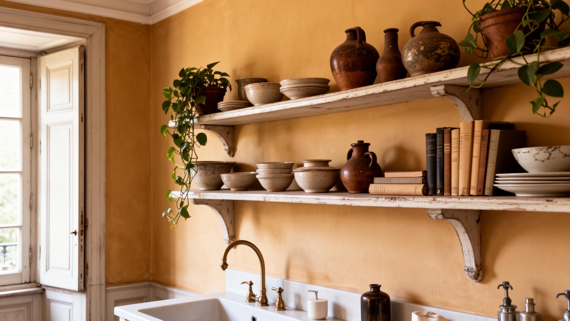
Kitchen shelving: Function comes first. Keep everyday items, plates, bowls, glasses, within easy reach and arranged by type. Supplement with a few decorative pieces: a vintage crock, a small cutting board, a plant. The best kitchen shelving looks effortless but is actually carefully considered for both aesthetics and practicality.
Living room shelving: This is where you can be most expressive. Mix books with objects, personal photographs with collected pieces. A living room shelf should feel like a portrait of the household, layered, personal, and evolving over time.
Bathroom shelving: Keep it minimal. A stack of folded towels, a quality soap, a small plant or candle. Bathrooms have enough visual noise with fixtures and fittings; the shelving should feel like a calm counterpoint.
Bedroom shelving: Books, a small lamp, personal objects. Bedroom shelves should feel quiet and intimate. Avoid anything that creates visual stress, keep the palette soft and the arrangement simple.
Practical Considerations
Dust is real. Open shelving requires regular attention. If the idea of dusting shelves weekly fills you with dread, consider shelving only in rooms where you spend the most time and are most likely to maintain it. Closed storage might be the more honest choice for other rooms.
Weight matters. Heavy stoneware, stacks of books, and large plants need sturdy shelving. Floating shelves have weight limits that are easier to exceed than you might think. If in doubt, choose bracket-mounted shelving with proper wall fixings, especially in older properties where the walls may be plaster over lath.
Lighting transforms shelving. A small picture light above a shelf, or discreet LED strips beneath each shelf, adds warmth and draws attention to your objects. Shelving in a dark corner without lighting never has the same impact.
Evolving Over Time
The best-styled shelves are not static. They evolve as you collect, travel, and change. Swap things out seasonally, a branch of blossom in spring, a collected shell in summer, a candle and dried foliage in autumn. Rotate books, introduce new finds, retire things that no longer feel right.
This is one of the joys of open shelving: it is never finished. It is a living, changing reflection of the home and the people in it.
Styling open shelving is really about editing: choosing what deserves to be seen, giving each piece enough space to be appreciated, and finding the balance between personality and restraint. The goal is not perfection, it is character.