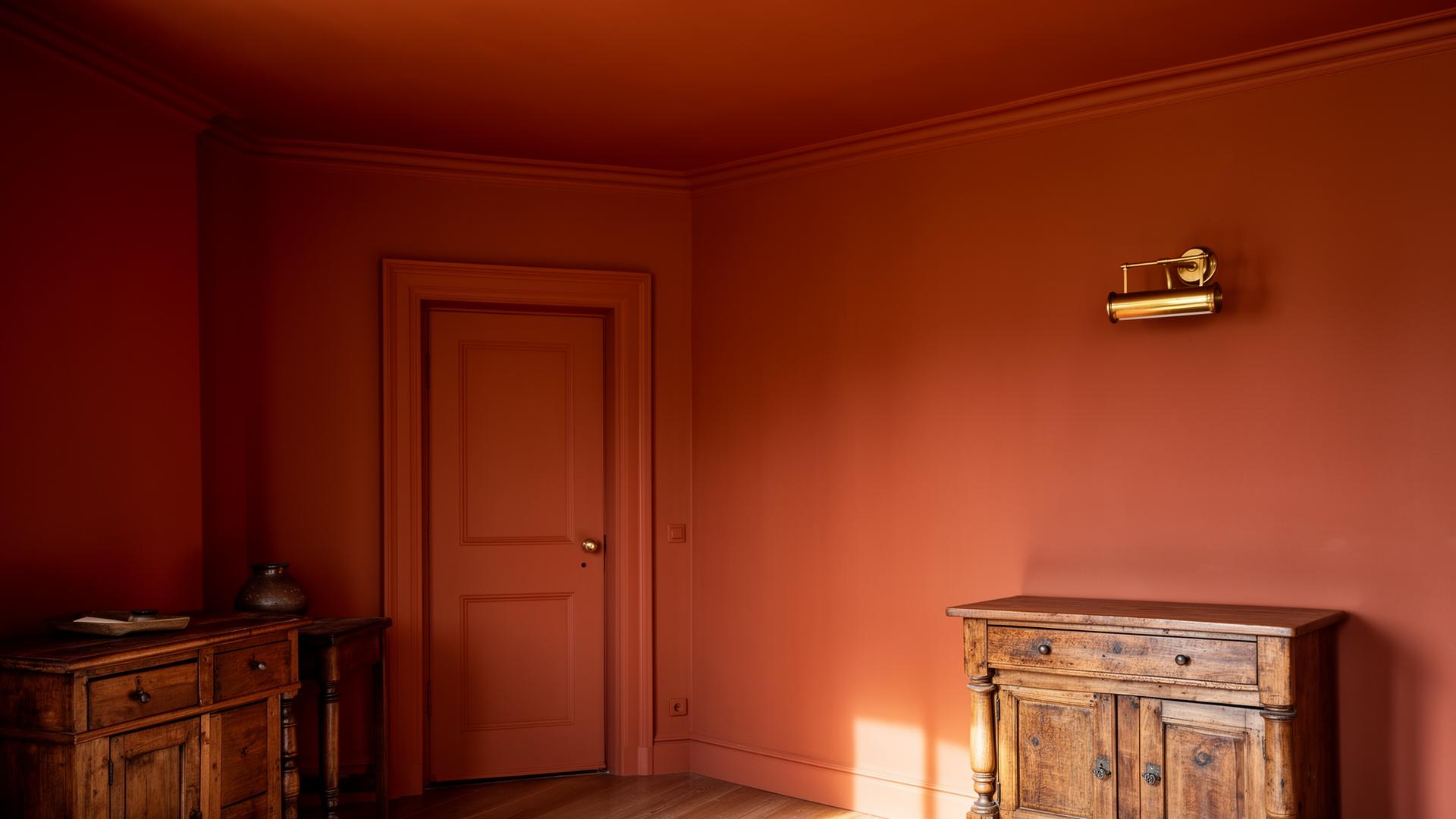
Colour drenching is the practice of painting a whole room, walls, ceiling, trim, doors and sometimes joinery, in a single shade. It is not a new idea. Look at any well-preserved Georgian library or seventeenth century Dutch parlour and you will find rooms enveloped in one colour, often a deep green, an oxblood or a smoky brown. What feels current is the willingness to do this in ordinary homes, in rooms that previously defaulted to white walls and white ceilings out of habit rather than conviction.
What Drenching Actually Does
A drenched room reads as a single volume rather than a collection of surfaces. The eye stops cataloguing the cornice, the architrave, the radiator cover, the picture rail. Instead, the architecture recedes and the objects in the room come forward: the sofa, the painting, the lamp, the person sitting in the chair. This is why drenching works so well in rooms with a great deal of fussy trim. Painted out, the trim becomes texture rather than line.
It also flatters awkward proportions. A low ceiling painted the same colour as the walls feels less low. A boxy room with too many doors feels calmer when the doors disappear into the walls. A loft with sloped ceilings becomes a single embracing volume rather than a series of intersecting planes.
Choosing the Colour
The colour is the whole game. A pale cream drenched across an entire room reads as a soft, enveloping neutral. A deep green reads as a study or a snug. A clay terracotta reads as warm and Mediterranean. The same technique, very different rooms.
A few principles I return to.
Pick a Colour You Can Live With at Every Hour
Drenched rooms cannot be edited piece by piece. The colour will be present at breakfast, at noon, at dusk and by lamplight. Test large samples on at least two walls, and look at them across a full day before committing. Pay particular attention to evenings, when warm artificial light shifts cool colours noticeably and saturates warm ones.
Lean Towards Pigment-Rich Paints
Heritage paint companies such as Farrow and Ball, Little Greene, Paint and Paper Library and Edward Bulmer formulate with deeper pigment loads, which means the colour holds its character as light shifts through the day. Cheaper paints can read flat or chalky in a drenched room because every surface amplifies the weakness.
Reliable Drenching Colours
A short list worth returning to. Treat these as starting points, not prescriptions, because every room takes a colour differently.
- Farrow and Ball Pigeon: a soft mid-grey-green that reads quiet but never cold.
- Farrow and Ball Bancha: a deeper olive green that suits libraries, dining rooms and anywhere you want a sense of repose.
- Farrow and Ball Setting Plaster: a powdery pink that flatters timber and brass.
- Little Greene Castell Pink: a warmer, richer pink for north-facing rooms that need lifting.
- Edward Bulmer Invisible Green: a deep, almost black green for snug rooms and entry halls.
- Farrow and Ball Tanner''s Brown: a smoky, leathery brown that reads as a warm neutral once you live with it.
Finish Strategy
This is where many drenched rooms fall down. Painting everything in the same colour but the same finish creates a flat, plasticky result. The trick is to vary sheen.
A reliable formula:
- Walls in a flat or matt finish, which absorbs light and reads as the dominant texture.
- Ceiling in the same flat or matt, so it disappears into the walls.
- Trim, doors and joinery in eggshell or satin, which catches light differently and reveals the architectural detail without breaking the colour relationship.
- Radiators in eggshell, painted in the same colour. A good decorator will sand and prime so the finish lasts.
The eye reads this as a single colour, but the room has depth because each surface reflects light differently. This is the hidden craft of a well-drenched room.
Rooms That Take Drenching Well
In my experience, drenching works most reliably in:
- Studies, libraries and snugs, where envelopment is the point.
- Dining rooms used mainly in the evening, where deep colour comes alive by candlelight.
- Bathrooms, particularly windowless ones, where a saturated colour turns a small space into a jewel-box rather than a cupboard.
- Entry halls, where a single confident colour sets the tone for the whole house.
- Bedrooms, where the enveloping quality reads as restful rather than overwhelming.
Rooms Where I Hesitate
I am more cautious about drenching:
- Open-plan living-kitchens, where the colour has to carry across very different functions and lighting conditions.
- Rooms with large amounts of strong natural light all day, where saturated colours can read garish.
- Rooms where the architecture is genuinely beautiful and worth highlighting, such as a room with original mouldings you want to read clearly. Sometimes a contrasting trim is the more honest choice.
Practical Order of Work
If you are committing to a drenched room, the order matters.
- Strip and sand any heavily layered trim. A drenched room amplifies texture, so lumpy paintwork becomes more obvious, not less.
- Prime everything with a tinted undercoat in a similar tone to the final colour. This reduces the number of topcoats needed and improves coverage.
- Paint the ceiling first, then walls, then trim. Always work top to bottom.
- Allow proper drying time between coats, particularly with deeper colours, which can dry patchy if rushed.
- Live with the room for a week before adding art. Drenched rooms often need less on the walls than you think, because the colour itself is doing the work.
A Final Thought
Colour drenching is a commitment. It is not a weekend project, and it does not undo cheaply. But done well, it produces some of the most quietly confident rooms I know: rooms that feel settled the moment you walk in, where the architecture and the objects sit in conversation rather than competing for attention.